In one of Rainer Maria Rilke’s letters to his wife he remarks about art: “Surely all art is the result of one’s having been in danger, of having gone through an experience all the way to the end, to where no one can go any further. The further one goes, the more private, the more personal, the more singular an experience becomes, and the thing one is making is, finally, the necessary, irrepressible, and as nearly as possible, definitive utterance of this singularity… Therein lies the enormous aid the work of art brings to the life of the one who must make it, that it is his epitome; the knot in the rosary at which his life recites a prayer, the ever-returning proof to himself of his unity and genuineness, which presents itself only to him while appearing anonymous to the outside, nameless, existing merely as necessity, as reality, as being-” (Letters on Cezanne, translated by Joel Agee, Fromm International Publishing Corporation, New York, 1985)
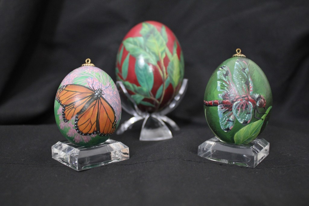
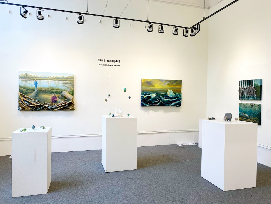
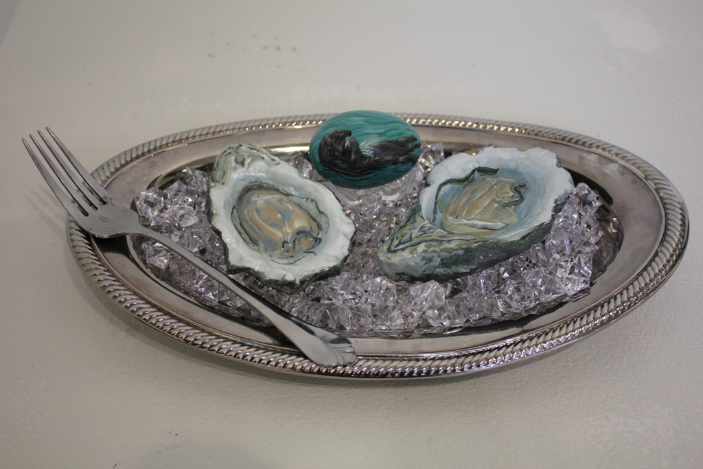
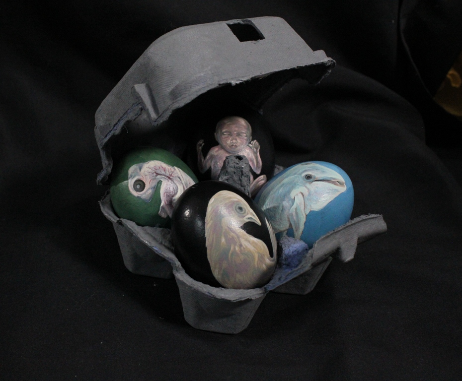
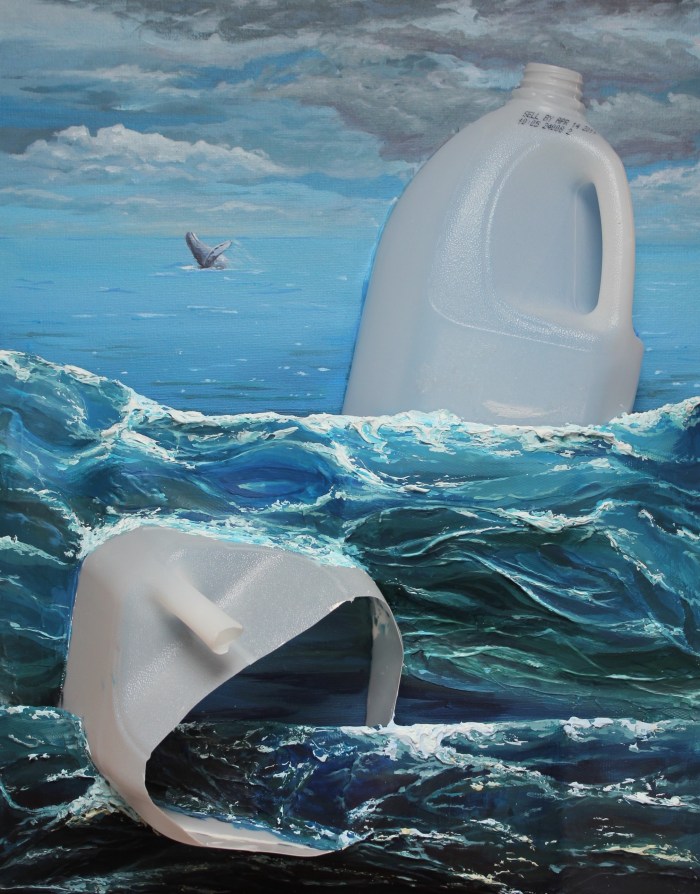
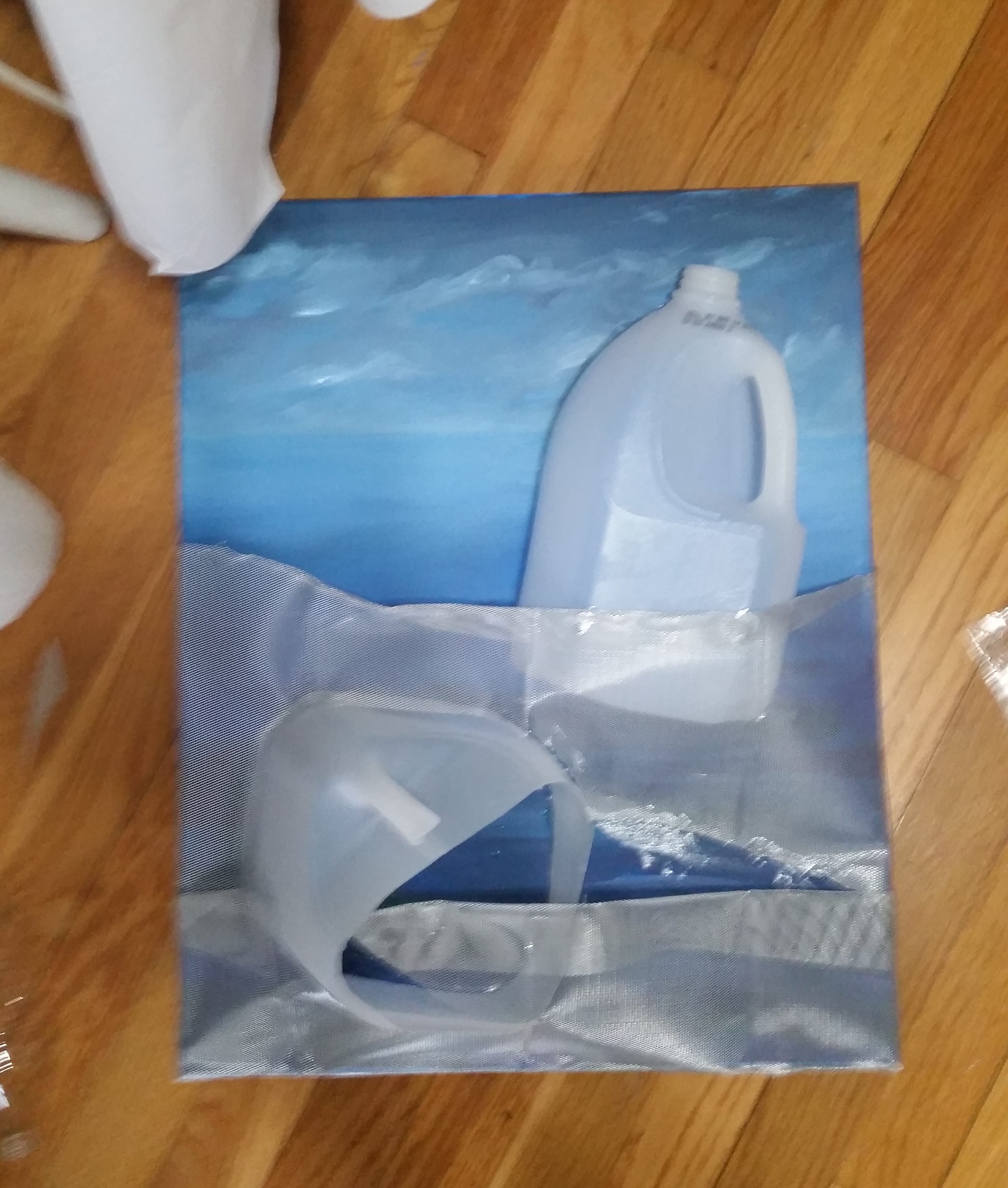
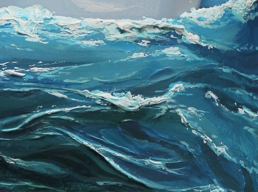
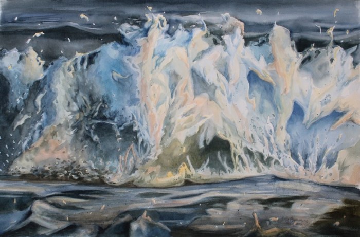
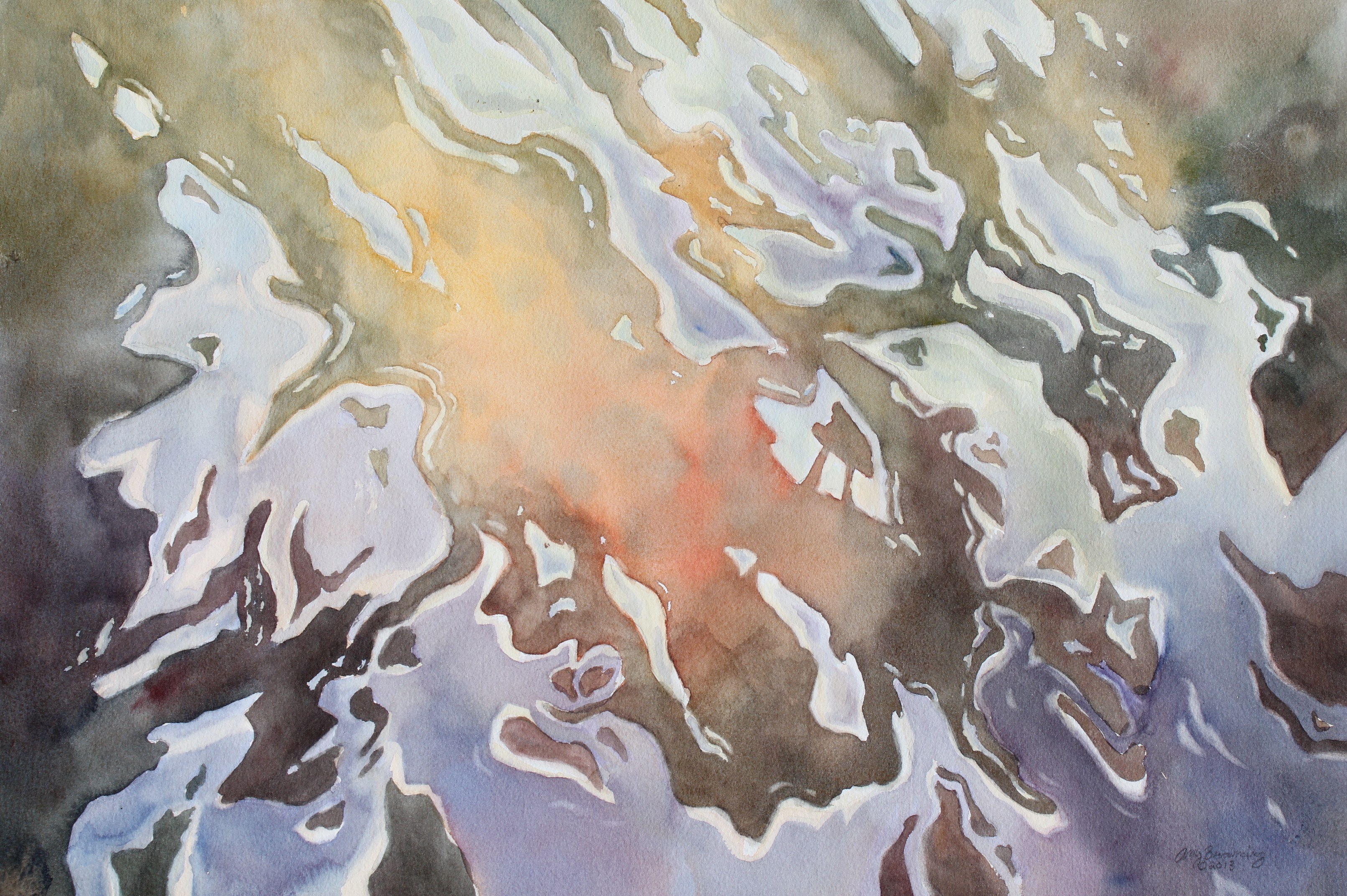
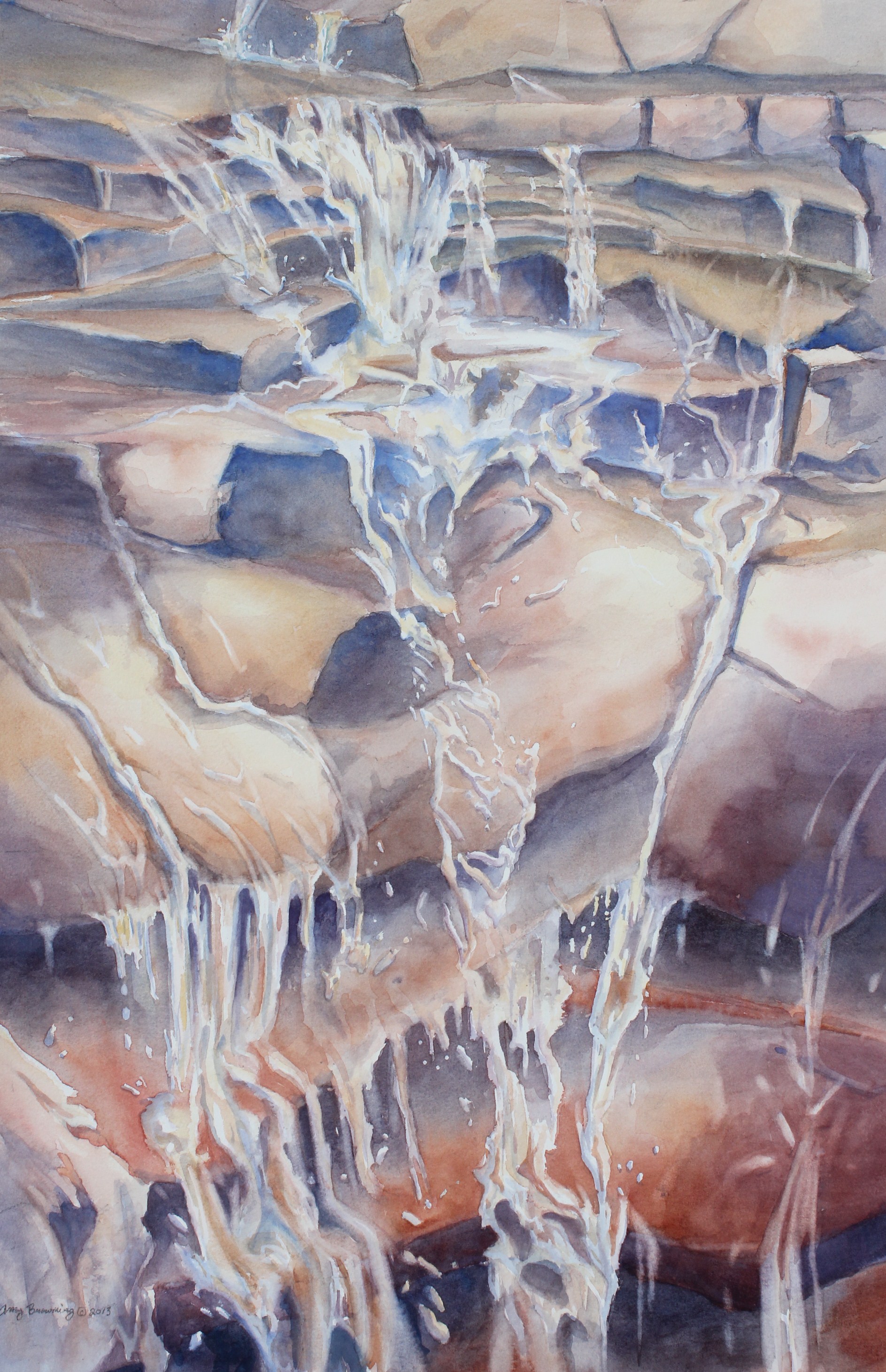
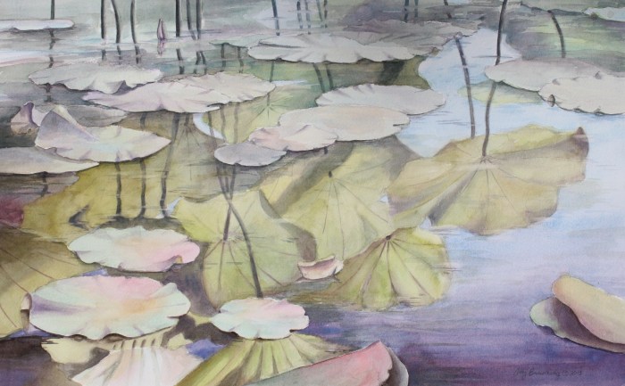
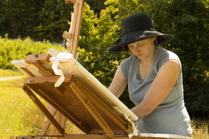
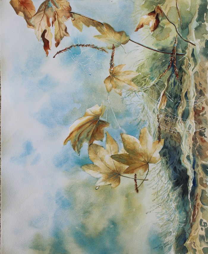
This quote resonated with me when I read it. My most recent solo exhibit closed at the end of October, and as I was driving home with the paintings, I reflected on my experience creating a body of work that had a deeper meaning to me personally than anything else I had done in the past. Poiema, Mortality and Resurrection is a series of paintings that explores themes of death, decay and new life as is experienced in the flora and fauna of the changing seasons. Juxtaposed to watercolor paintings are eggshells painted in acrylics, further illustrating the change of the seasons and the marching on of life. The paintings are accompanied by excerpts of poetry from Rainer Maria Rilke, David the Psalmist, the Anglo-Saxons and more.

The seeds of the concept for this series sprouted four years before, after a time when I was in danger, but until last year, I was hesitant to bring it to completion. This was for two reasons. One was that I had to deeply contemplate my own mortality in the process of creating it, and the other was I had to be open to sharing my personal beliefs about life, death and the resurrection. I believe the fear of being rejected is so much worse when you’re sharing a private aspect of yourself with the world. I had, however, heard it again and again from artists and actors that you should create work that is meaningful to you personally and it will also be meaningful to those who see it. This was my attempt at doing so, and why I encourage other artists to do the same.
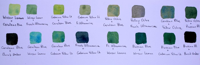
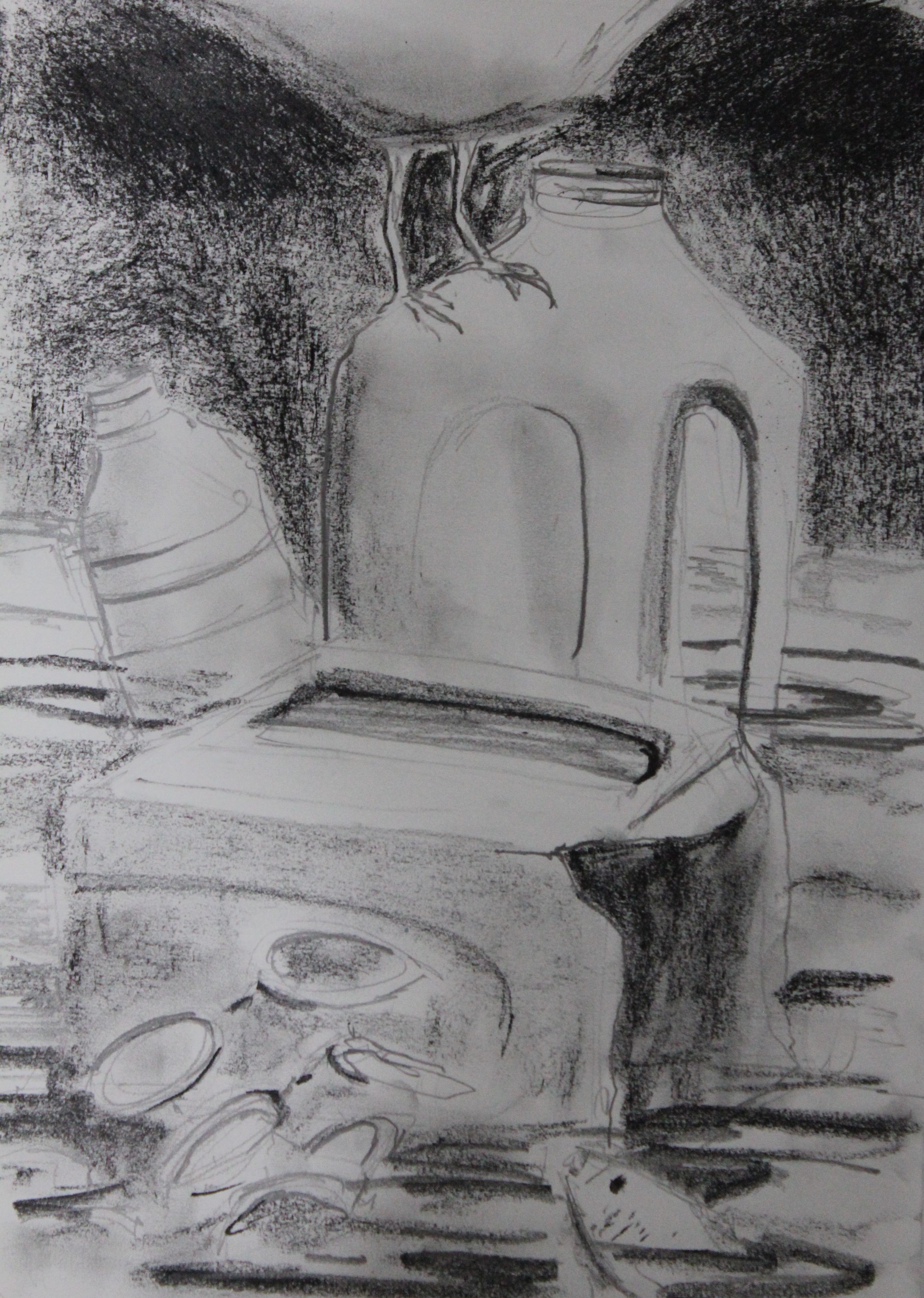
This body of work was one where I drew from many creative sources for inspiration. Early on, I decided the paintings would be inspired by poetry after discovering Rilke’s poem, “Autumn”, and his description of Autumn that he wrote to his wife in his Letters on Cezanne. I later discovered a whole slew of Anglo Saxon poetry that highlighted life and resurrection in Winters in the World by Eleanor Parker, which ended up being my biggest resource. Basing a series around poetry forced me to read more than I have in nearly 20 years. I read Shakespeare’s sonnets, William Blake, the Psalms of David and Solomon, and others in an attempt to find poetry that would put into words what I wanted to express in images. Allowing poets to inspire me was like having a conversation with those poets across time. It was nourishing and rewarding to my artist soul.

While I was painting, I contemplated a lot about life and purpose. I often weigh the importance of what I am making with my overall purpose, which is, frankly, raising my children and caring for the people around me. Is what I am making worth my time spent alone? Am I doing it to benefit my soul or others or is it for vainglory? (I admit having had created work for vainglory, and it wasn’t spiritually fulfilling. It’s a constant struggle as an artist. To clarify, creating for vainglory is different than creating for income.) As I was working on Poiema, Mortality and Resurrection, my work became both a meditation on life and mortality and oftentimes a prayer. Working on the paintings in the early morning hours before the household awoke helped me to organize my thoughts before starting the day. As I was creating the work, I thought that it didn’t matter as much if they’re seen by many people, because the act of painting changed me personally. I realized that this is one of the reasons to create what is important to you. Even if your work is not seen by many, you personally gain something from it. Rilke’s quote reminded me of my own experience: “Therein lies the enormous aid the work of art brings to the life of the one who must make it, that it is his epitome; the knot in the rosary at which his life recites a prayer”.
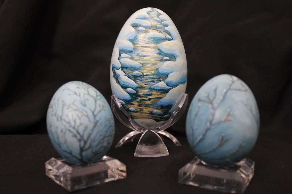
In the end, I believe those who had said that if you connect with an idea, others will too, were correct. I kept a notebook with my paintings where visitors could comment on the exhibit. I had some write that they connected with the eggshells, because it reminded them of their childhood and family from Eastern Europe. Others wrote comments that made me realize they found the exhibit meaningful in other ways. This was my desire for this exhibit and knowing that others found it meaningful made it all the more meaningful to me. I hope to keep this in mind as I choose my projects in the future. Time is precious. It could either be spent trying to impress others and make yourself into what others think you should be, or being authentic in the projects you choose to work on, seeking what is true and benefiting yourself spiritually as well as others who see your work.