If you look through my portfolio you’ll notice how much I enjoy painting landscapes. I also happen to love the color green. I’m not sure whether I love green because I love landscapes, or I love landscapes because I love the color green? It doesn’t matter. Green is often thought to be a calming color, and I definitely feel calmer when I’m surrounded by it. Until you start painting, however, you don’t notice how many different shades of green there are. Beginning artists learn that you mix yellow and blue together to make green, but you don’t learn until painting awhile how much greens can vary depending on which yellow and blue you decide to use. On my palette you won’t find a green that is premixed. This is because I find that greens are more interesting when you mix them yourselves, either on your palette or directly on the watercolor paper. When you mix the greens yourself, you can achieve a wider range of hues from blue-green to yellow-green. Until I travelled to other parts of the world, I didn’t realize how much the color green can vary depending on where you live, the flora that grows there, as well as the weather. The following blog post is intended to give you a little glimpse into a journey I took in discovering my personal palette of greens.
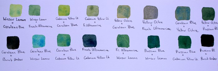
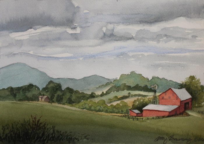
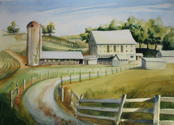
I grew up in rural Maryland and have been painting the landscapes there since I was a teenager. Once a year I return to Maryland to participate in a plein air painting event to paint historic barns. Maryland is very green in the Spring, but the grass can yellow in the Summer as it rains less often in those months. After years of painting in Maryland and Virginia I discovered that ultramarine blue mixed with Winsor lemon, cadmium yellow light, or yellow ochre worked well for the various shades of greens in the fields and trees. For the darker, forest greens I used Prussian blue mixed with various yellows. After some experimentation in my teen years, I discovered that Prussian blue mixed with burnt umber makes a gorgeous hunter green. This color found its way into every one of my paintings for about 10 years.
In 2014 my husband and I took our young family on a trip to Ireland. I was blown away by the beauty of the landscapes there, especially after taking a drive through the Ring of Kerry. No other place have I seen green hills covered in heather that slope right down to the sea. I love both mountains and sea, so western Ireland was like a dream for me. The other thing that everyone mentions about Ireland after visiting (and it’s totally true), is how green it is. And Ireland’s not just green, but it’s a different shade of green than I had ever seen! I don’t feel like the photographs I took while in Ireland quite captured the greens in the landscape. But I started painting the landscapes soon after arriving back to the States while the scenery was still fresh in my mind.
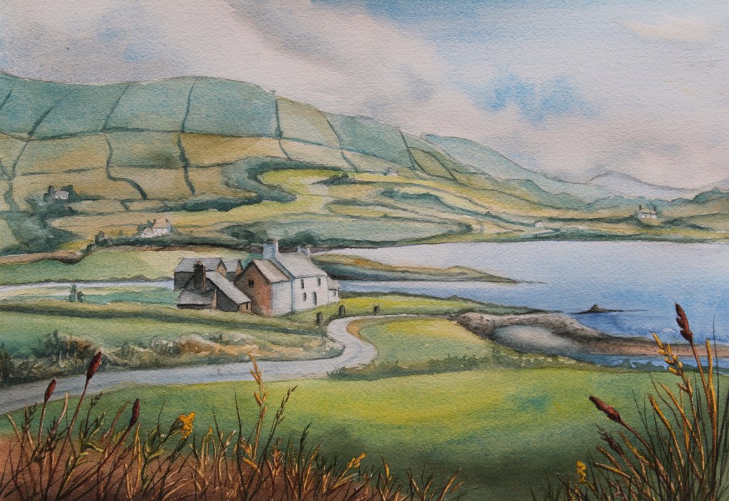
As I began to paint, I realized I needed to find a new combination of yellow and blue to capture that gorgeous, bright green I had seen in Ireland. I turned to cerulean blue to mix my colors. Cerulean blue plus cadmium yellow light makes what you would call Kelly Green. If you mix the cerulean blue with Winsor lemon you get a bluer shade of the Kelly Green. Add more yellow than blue and you can create the effect of light on the grass. If I wanted to paint grass that was yellowing, I combined yellow ochre with cerulean blue. I was excited by the possibilities of these color combinations! My subsequent paintings of Ireland captured the atmosphere of the countryside and successfully sold within months of completion.
I look forward to explore a new part of the world someday and discover new shades of green. The rainforest is still on my list of places to visit. I wonder which blues and yellows I’ll need to capture the greens there. What are some of your favorite blues and yellows to mix to capture the landscapes you like to paint?